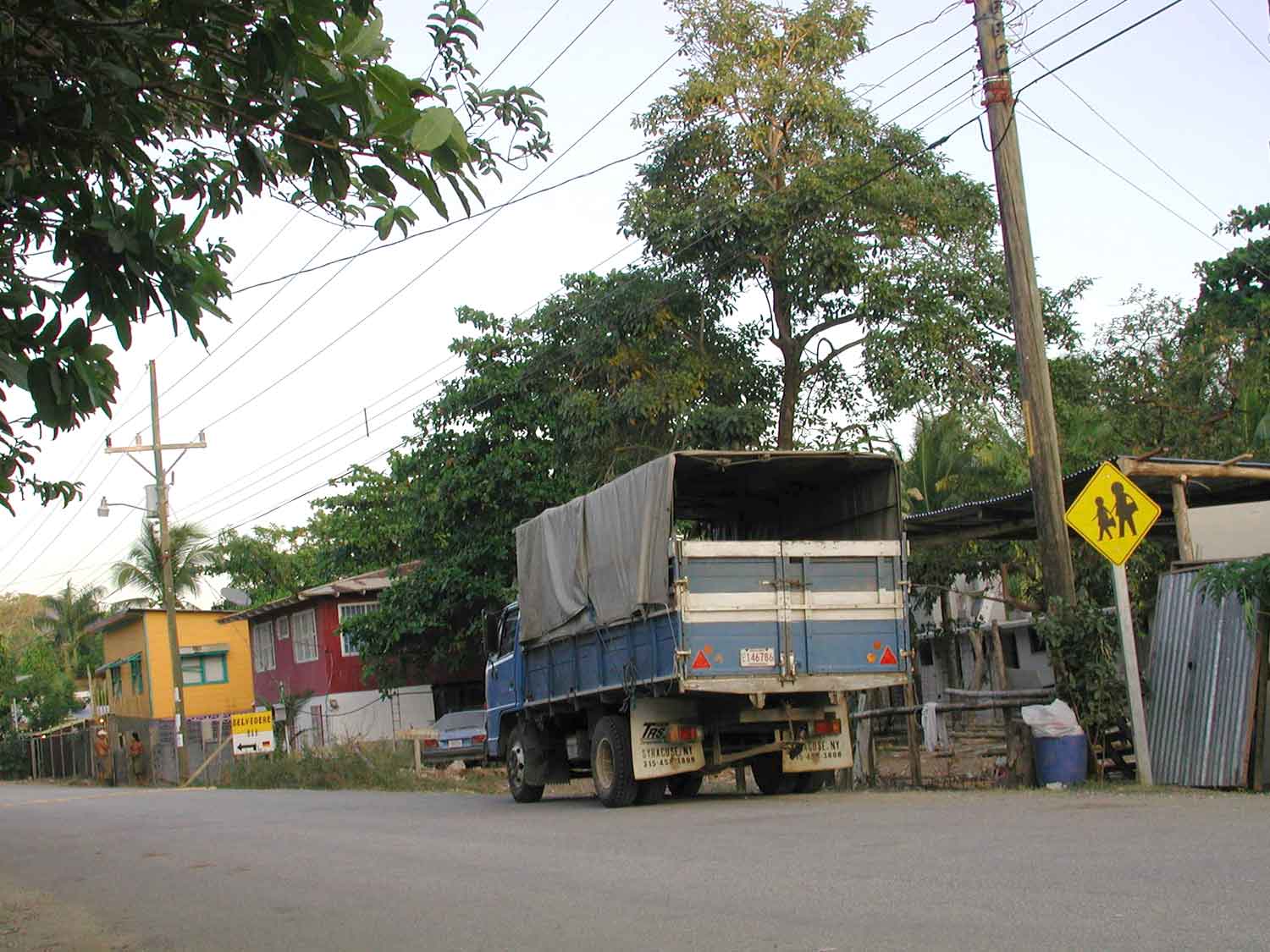
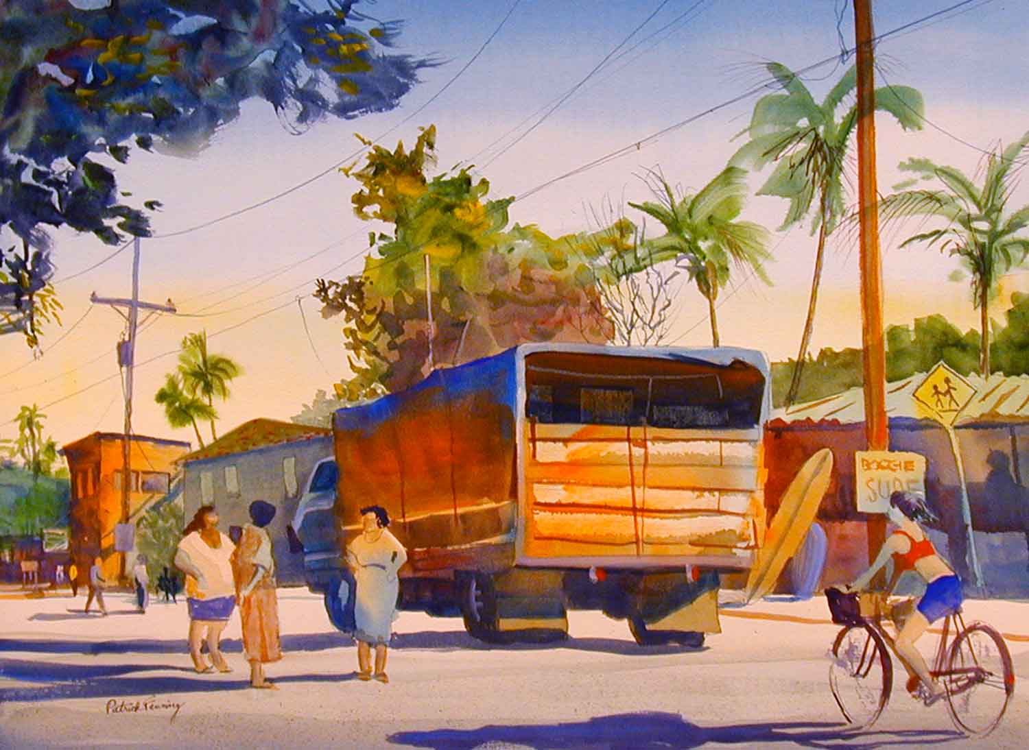
This is a view of the main street in Samara, Costa Rica, where I was teaching a plein air workshop. I had a great time sketching and painting in town, with the usual problem of people not holding still and posing. When I got home I wanted to do one large studio painting that would sum up my whole two week experience and express the casual charm of of this Pacific coast beach town.
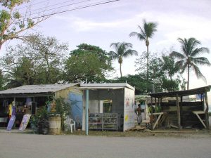
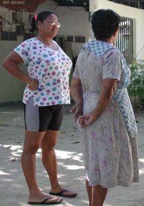
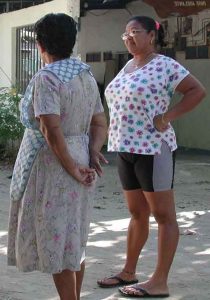
I used the Photoshop program to combine four pictures from my digital camera. It often takes several photos to cover all the details you want to include in this kind of street scene.
Picking & Choosing
I liked the truck and the perspective of the photo on the left, but I wanted to include the palm trees and surf shop from the photo below.
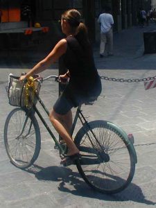
From three other snapshots I selected, cut and pasted a group of women and a girl on a bike. Photoshop allows you to flip, resize, crop, cut out, and paste photos with ease.
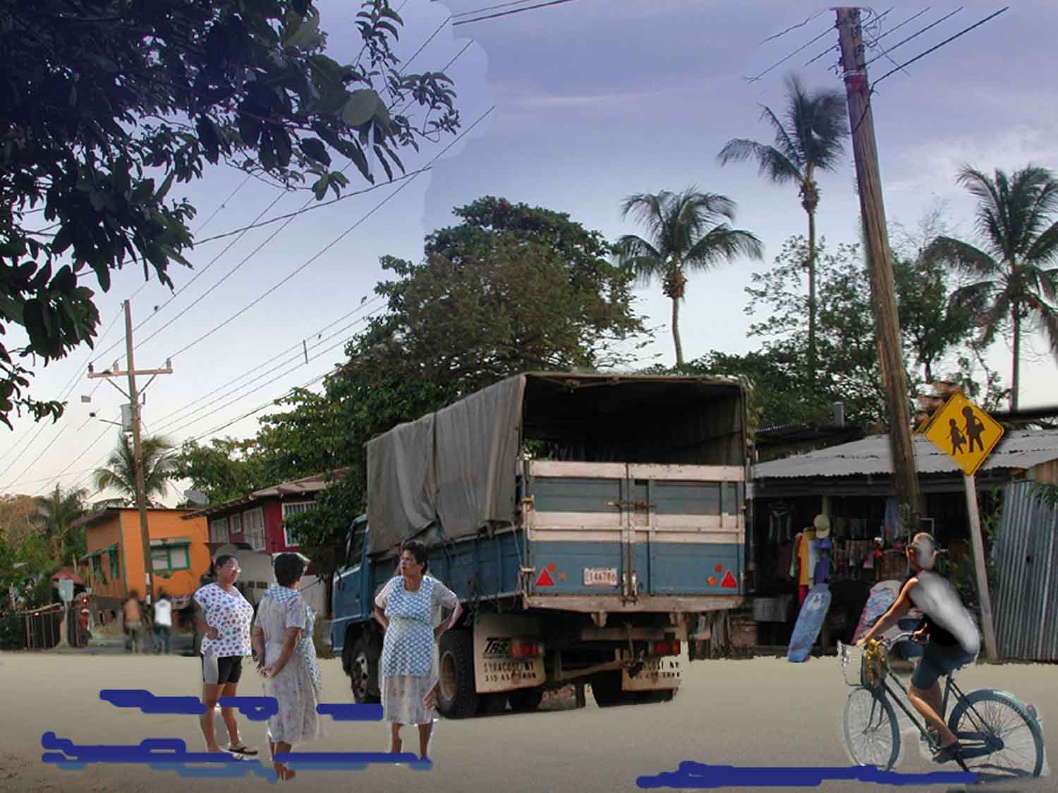
Here is the composite “sketch” made with Photoshop:
Since I was more interested in combining large shapes and figures than in creating a polished piece of trick photography, I could very quickly try out different compositions and ideas.
I used Photoshop’s drawing and painting tools to create a gradation in the foreground and block in some cast shadows. I brought the telephone pole on the right down in front of the surf shop.
I didn’t worry about minor glitches such as the telephone wires in the sky that don’t match up. The hacked-up, rough quality of the composite photo was actually a boon, because it allowed me to make up my own color scheme, invent a light source, and resolve small details at the painting stage.
Here is the finished painting:
Experimenting With Color & Without Color
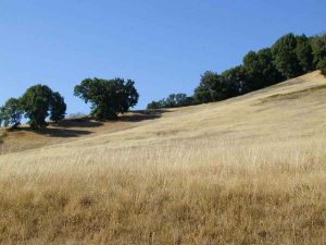
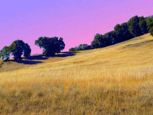
Sometimes you like a photo, but the harsh sunlight of midday has washed out the color. Here’s a ho-hum photo that I enchanced by over-saturating the colors to see what it would look like with a more intense color scheme.
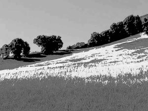
On the other hand, sometimes you’d like to eliminate color entirely, to see the values better.
Turning a Good Photo Into a Better Composition
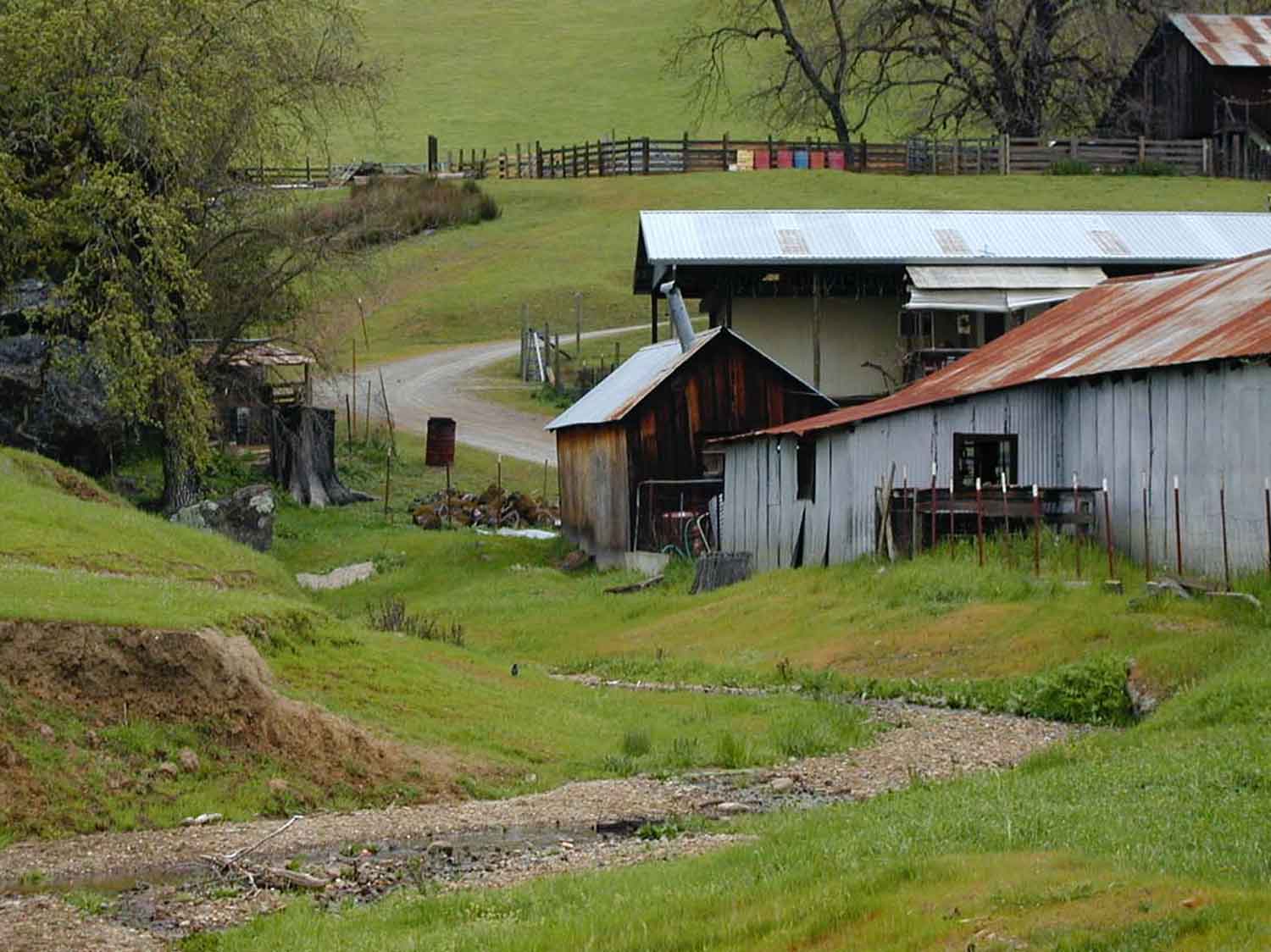
This is a pretty good photo, but it presents some problems: All the buildings are on the right side. The dry creek bed in the foreground isn’t a very strong lead-in to the picture. The background is boring and oppressive because you can’t see the sky. Finally, there’s too much high intensity green.
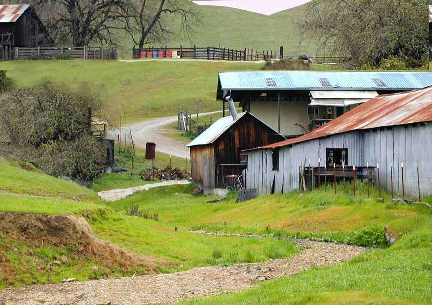
In the Photoshop sketch version, the fence and trees in the background have been flipped to the left and a barn from another photo has been added in the upper left to balance the mass of buildings on the right. A bit of sky was added to show some hill tops.
Notice how the greens have been tweaked: lighter and most intense in the foreground, neutralized in the middle ground, and much grayer in the background. This adds depth and variety
I extended the dirt road in the middle ground so that it winds around the buildings, up the hill, and in front of the fence in the background.
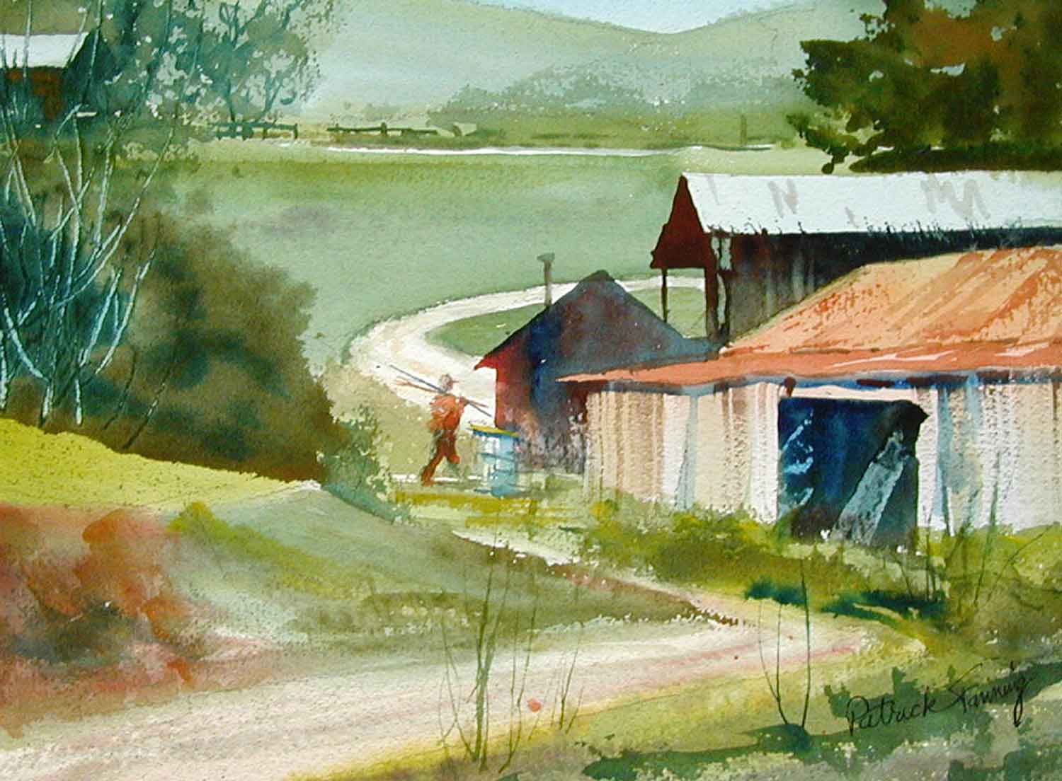
In the painted version, I added a figure from my sketchbook. The dry creekbed in the foreground has become a dirt road leading into the scene. The buildings are simplified and shifted to show more of the road winding through the composition.

