
Most experienced artists have heard so much about the color wheel that their eyes start to glaze over as soon as they read the words. But it bears continued study. Indeed, if you think carefully about the full implications of the color wheel, you might agree that it needs to be reinvented.
Let’s begin by defining three key color terms as used in this post:
Hue is the easiest component of color to understand. When people ask, “What color is it?” they are usually asking about the hue. Hue refers to the common, handy names we use to indicate color families: yellow, red, blue, green, and so on. Paint manufacturers use names like Naples yellow, Indian yellow, Aureolin yellow, yellow ochre, and cadmium yellow to distinguish among various similar hues that are members of a larger color family.
Value refers to the relative lightness or darkness of a color when compared to a gray scale. For example, a watercolor hue is typically at its lowest value as it comes from the tube. Dilution with water makes it lighter in value. Oil painters add white to make a hue lighter in value, and black to make it darker.
Intensity is the relative “brightness,” “purity” or “power” of a color. This is the most subjective component of color, and the most confusing. Blood, rubies, and Coke logos are intense reds; Rusty iron, Irish setters, and blushes are less intense reds. For those familiar with common paint names, cadmium yellow is a full intensity yellow, whereas yellow ochre is a less intense yellow. Ultramarine blue is a full intensity blue, whereas indigo is a lower intensity blue.
Most artists’ paints are at their most intense as they come from the tube. The exceptions are some naturally dark, very low value blues and violets, which seem to reach their maximum intensity when slightly diluted with water or mixed with white.
You need all three of these terms–hue, value and intensity–to accurately describe a given color. The sun is a very intense, light value of yellow. A fresh bruise is a low intensity, medium value of blue. A robin’s breast in spring is a fairly intense, light value of red-orange.
Talking about colors can be confusing. Someone might say, “That red needs to be brighter,” meaning lighter in value. But you might interpret it as a request to add more pure red pigment to make it more intense. Most artists mean “go darker” when they say “lower the value,” but some mean the opposite. Some prefer other terms for the components of color, such as “chroma” or “saturation.” To avoid confusion , I will be very careful to stick to the three terms I’ve defined above. I will talk about changes in value as “darker” or “lighter” only. And when talking about intensity, “high” means more intense and “low” means less intense.
The Conventional Color Wheel
This is the most common way of organizing and categorizing color. Most artists have a mental image of the color wheel, however vague, that they visualize when they choose and mix color.
Compared to the history of art, the color wheel has a relatively short history. It dates from the early nineteenth century, when it was developed along with advances in chemistry, paint manufacture, the physics of light, and the industrial revolution’s need for technical standards.
Origin of the Color Wheel
When a beam of sunlight passes though a prism, it splits into every color visible to the human eye–the colors of the rainbow. They are always in the same order because of the physics of light wavelengths. Violet blends into blue, blue blends into green, green into yellow, yellow into orange, and orange into red. If you bend this sequence into a circle, red blends neatly into violet to complete the circle that we call the color wheel.
When you start to arrange paint colors around a color wheel, conventional wisdom, early paint chemistry, and a misguided urge to simplify dictate that there are three “primary colors” that you ”can’t get by mixing”—yellow, blue and red. These primary colors are spaced evenly around the wheel. Between them are evenly spaced the three “secondary” colors–green, orange, and violet—the ones you “can get by mixing.” To this basic six color wheel you can also add six “tertiary” colors to get a twelve color wheel. Here is a typical twelve-hue wheel:
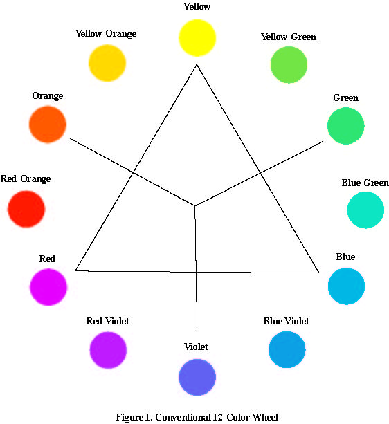
The nice thing about this wheel arrangement is that it places complementary color pairs opposite each other. When two true complements are mixed together in the right ratio, they produce a neutral gray. For instance, cadmium yellow and ultramarine violet make a neutral gray. Most color wheel theorists mention that the rim of the wheel contains “pure hues,” meaning the highest intensity possible, and place neutral gray at the center of the wheel. This is the origin of the color mixing advice “add a color’s complement to neutralize it.” It means that if the yellow is too intense straight out of the tube, add some violet to lower the intensity.
The best conventional color wheel I know of is the Quiller Wheel, developed by Colorado watermedia painter Steve Quiller. He has identified which commonly used artists’ colors are high intensity pure hues that belong on the rim of the color wheel, and placed them there in relation to each other. He locates various grays such as Davies and Paynes gray in relation to a perfectly neutral gray at the hub of the wheel. His greatest contribution is to accurately place “earth colors” – the less intense hues such as burnt umber or yellow ochre, at precise points within the wheel, and begin to draw the color mixing conclusions that this placement implies. Any painter who is serious about color should have a copy of the Quiller Wheel.
Drawbacks of the Wheel
At first, the color wheel is a revelation to the beginning painter. It seems like you only need to buy the three primary colors and you can mix all the rest. But when you go to buy “primary blue” you can’t find it at the art supply store. It seems there is quite a lot of argument over which blue is primary, and the same goes for red and yellow. So you pick the three likeliest and take them home, only to find that you can’t get a decent violet or an orange that isn’t dull or a really intense green.
Next you hear about the split primary system, so you try that. You settle on a warm and a cool yellow, a warm and a cool red, and a warm and a cool blue. With these you can mix anything. Almost. You still fall back on burnt sienna for brown and indigo or Paynes gray for dark darks. That really intense pink eludes you, so you pick up a tube of opera. Gold is hard to mix, and you can’t get it as intense as quinacridone gold, so you buy some of that. Your greens all look the same, so you treat yourself to some Hookers or sap green. Pretty soon you have a jumble of colors and the split primary system is out the window.
If you keep painting you will learn to limit yourself to two or three or four colors per painting, achieving color harmony by capitulating to a limited palette. You will have many formulas for mixing different shades and most of the time you’ll get the color you want, or close to it. People look at your paintings and say, “I love your colors,” never guessing at the trial and error, rote memory, and luck involved in your color choices. But do you ever get a nagging feeling that that there must be a better, simpler way?
You might study Steve Quiller’s books and force yourself to put away every color but the twelve full intensity hues he recommends. You’ll discover you can mix your own burnt sienna three different ways, learning a lot about color theory in the process. This is about as good as it gets. But then you go to one of Steve’s workshops and find out that he himself has more than twelve colors in his palette. What gives?
Color Disk
One day I inventoried the Quiller wheel. On the rim are 39 pure hues, called by 58 different names by paint manufacturers. On the inside of the wheel are another 30 hues, called by 38 different names. It’s too many and not enough at the same time. Thinking about the rainbow that is the inspiration for the color wheel in the first place, I realized that there is an infinite number of possible hues on the rim, and an infinite number of hues on the inside. In fact, it’s not a wheel at all. It’s a disk.
The trouble with the conventional color wheel is that it limits your thinking about color. The word “wheel” implies a rim, a hub or axle, and spokes—essentially a linear concept that encourages you to think of static dabs of paint connected by lines. A color disk makes more sense. A color disk is better suited to the gestalt nature of color as a rainbow, an infinitely blended field—a spatial rather than a linear concept.
Computer graphic artists are ahead of painters in this area. Programs such as Adobe Illustrator and Photoshop have “color pickers” that present you with a screen full of continuously blended color from which to choose, not a meager handful of polka dots arranged in a circle.
Here is a computer generated color disk, closely matching the medium values of twelve common watercolor hues.
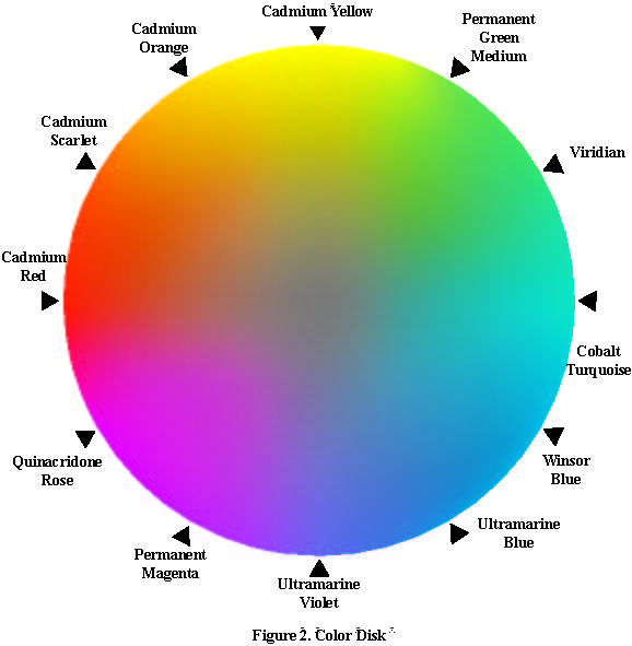
Notice that the disk has several advantages over the conventional wheel:
- The disk shows how one color blends into another, mimicking the way colors blend into one another in nature and in paintings.
- The disk shows that there are an almost infinite number of possible colors, limited only by your eyes’ ability to make fine color distinctions.
- The disk shows clearly how the intensity of each hue varies slowly as you move from the rim inward to the neutral gray center.
- The disk simplifies color mixing. Draw a line between any two hues on the rim. Those hues will mix all the hues on the line between them. If the line passes through the neutral gray center, the hues are perfect complements.
- The disk explains why you can’t mix all possible hues from three primaries. Draw a straight line from the cadmium yellow to the quinacridone rose. All the oranges you can mix with these two colors lie along that line. If you want the full intensity cadmium scarlet that lies above the line, you’ll have to buy the scarlet-you can’t mix it.
- The disk allows you to plan many different color schemes by “mapping” them on the disk itself.
- The disk allows you to analyze color schemes by mapping them on the disk to see if they make sense.
- A large version of the disk can be used to teach color theory quickly and easily.
The disk has a couple of drawbacks. It is very difficult to paint yourself a color disk, compared to the relative ease of painting your own color wheel. Secondly, any given disk can represent only one value of each hue, a problem shared by the conventional color wheel. On a computer screen, you can view the disk and change the value of the whole disk at once, in real time, seeing all the colors go from the palest pastel tints to the darkest possible saturations of each hue.
Color Mixing
To mix any hue, find it on the disk. Draw a straight line through the desired color and imagine this line rotating around the desired color like a propeller. If the straight line connects two other colors on the rim of the disk, those two colors can be mixed to make the target color.
Thus the color disk can show you several ways to mix the same color. On the dark value disk above there are three lines that intersect at a color similar to a low intensity burnt sienna. The lines show that you can mix this same brown three different ways: with cadmium orange and ultramarine blue, with cadmium yellow and permanent magenta, and with cadmium red and viridian.
If you play with the disk for a while, you begin to fully understand some of the more subtle truths about color mixing:
- The more intense a hue, the fewer practical ways to mix it.
- The less intense a hue, the more ways to mix it.
- It is impossible to change value without changing intensity.