
- Pick a key color – The Big Hand
Look at your subject matter and identify the key color, the pigment that you will use most in your painting. The key color may be a close match to the color that is actually most prevalent in the scene, or a color that you subjectively choose for its aesthetic or emotional effect. You might have to mix two pigments to arrive at your key color.
For example, in spring you might choose sap green mixed with a little aureolin yellow as the key color to represent the intense yellow green of the new grass.
2. Pick a supporting color – The Little Hand
Look at the scene and experiment with your key color to find the pigment that will be your supporting color. A good supporting color is usually a complement or near complement of the key color—a pigment that is one third to one half the way around the color disk from your key color.
For example, if yellow green is your key color in a spring landscape, you might choose a complementary quinacridone magenta as a supporting color. Experimenting with different proportions of the two colors will show you the range of neutralized (grayed) greens and red-violets that you can use to represent shadow areas, distant hills, and so on.
On the other hand, if your scene includes a large brown barn, you might choose cadmium red as your supporting color, to give you a range of brown tones when the red and yellow-green combine. Or if your composition has a lot of blue sky and cool gray clouds, you might choose ultramarine violet as the supporting color.
3. Consider an accent or stealth color – The Second Hand
Often two pigments are all you need. Experiment with various mixtures of your key and supporting colors to see if you can get a sufficient variety of hues and dark enough values to render your subject effectively. Two-pigment color schemes are more versatile and effective than most beginners realize. They offer rich opportunities for subtle semi-neutral passages, warm/cool gradations, and vibrant hue contrasts.
If two pigments won’t give you the hues you want or won’t go dark enough for the value range you want, pick an accent color. In general, a good accent color will be as far away as possible from the key and supporting colors on the color disk.
For example a good accent color for the green—magenta combination might be cadmium red, which would darken the greens, make a brown for buildings, warm up the magenta, and provide a nice bright red accent on a figure’s shirt, tractor, or sign.
On the other hand, if your key color is green and your supporting color is cadmium red, you might choose cobalt blue as your accent color. The turquoise would mix well with the yellow/green to render distant foliage and evergreens. Mixed with the cadmium red it would provide interesting warm and cool grays. Used full intensity, it would provide an effective accent at the center of interest.
Consider using your accent color as a stealth color. A stealth color is used to darken and gray your key and supporting colors, but is never used in sufficient quantity to show up as a third color. For example, if your key color is yellow/green and your supporting color is ultramarine blue, you might use permanent rose as a stealth color. The permanent rose would be handy for making neutral and warm grays with the green and the blue, but would not be used in sufficient quantities to show up as rose in the finished painting.
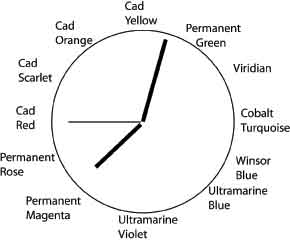
In your sketchbook you can use a clockface to remind yourself of the color scheme you have chosen. The big hand indicates the key color, the little hand indicates the supporting color, and the second hand indicates the accent or stealth color. I’m happy about what colors go well with sage green. I can honestly say that it was my favorite.
Just as you wouldn’t want a clock with six or seven hands, you don’t want a color scheme with six or seven pigments. It’s too confusing, and you’ll get mud in no time at all.